Table of contents
Updated - June 1, 2025
The online tool Canva was launched in Sydney, Australia, in 2012 with the mission "Empowering the world to design", making graphic design possible for everyone.
Melanie Perkins, Cliff Obrecht and Cameron Adams primarily pursue the goal of "making a positive impact on the world by doing as much good as possible."
They are also involved in "Level two", which represents four pillars, namely "Strengthening non-profit organizations", "Securing basic human needs", "Enabling quality education" and "Supporting local communities".
Pricing
The basic functions of the tool are free of charge. However, if you really want to do more than just rudimentary graphic design, these are very limited in their scope.
A paid Pro version offers the full - and very extensive - range of features. The Teams version allows at least three users to use the license. This is available for an annual subscription of USD 100 per user. For around 8 euros per month, this is a very fair offer, in line with the company philosophy.
Scope of services - Target group
The scope of services is more than impressive. There is almost nothing that cannot be realized. Fonts, font types, font sizes, font colors, graphic elements, photos, videos, AI, background designs, even the removal of photo backgrounds is cleanly solved with one click, mostly anyway, depending on the complexity of the same, of course.
A list of all the possibilities would probably fill several pages. It's definitely time to try them out - free of charge, of course.
If you are a graphic designer, you will stick to professional programs, as they offer not only the same, but a much more individual scope of services. However, experience in using such programs is essential, and the learning curve is correspondingly steep if you have not studied graphic design and have therefore been able to gain practical experience.
The target group is therefore predominantly non-professionals who should be able to use the tools offered to create graphics that are sufficient for occasional and private use. However, smaller companies that cannot afford a graphic designer and do not want to outsource the work are also target groups.
Application
I would like to compare the use of the tools on offer with the large toolbox of an electrician or car mechanic.
The layman therefore has all the tools he needs to carry out the specific work. But what do we do with all the screwdrivers, pliers, wire strippers, measuring devices, nut sets, ratchets, wrenches and ring wrenches, etc.?
Can we really solve a - somewhat more complex - technical problem with the tool alone, without any specialist knowledge?
Canva offers video tutorials covering various topics for this purpose. These are suitable for getting a first impression of how to use the tools and create your own design.
Basics
The basics of space utilization, balance of elements, structuring, texture, shapes, lines, colors, typography, texture and branding are unfortunately left to the free imagination of the user.
However, it is precisely these aspects that are decisive for an appealing, balanced and meaningful design that is able to convey its effect in a targeted and effective manner.
This article aims to fill this gap.
All beginnings ...
... is difficult. Motivation, necessity and commitment determine success or failure. The old adage 'no pain, no gain' also applies here. So, if you want to, you can!
So let's proceed step by step and examine each of the aforementioned topics, learn the background in order to realize the desired success with the desired design!
Step by step
Room utilization
Let's imagine we have a beautiful, large, bright room that we can furnish and design with existing objects. The existing objects can be compared with the predefined design elements in Canva.
Just as we won't pile up all the furniture, carpets, pictures, etc. in one corner of the room, we won't pile up graphic elements on top of each other.
Consequently, the space will be divided into areas that are inviting, those that encourage people to linger and those that are purely informative.
One could also imagine a grid that covers the room and allows the arrangement of the various objects to be structured. It helps to create order, take the viewer by the hand and guide them through the content. First to perceive the important things, then to read the explanation and grasp the quintessence, be it an event date, place and time, a Zoom meeting or whatever.
Even a cursory glance at the design should allow the viewer to remember the three essential contents in passing: what it is about (keyword and brief description), where and when it takes place.
Balance
We place the coffee table in the middle of the room, with the sofa and the two armchairs directly in front of it and the floor lamp in the middle in front of the table. If you want to sit on the sofa, you first have to pull the sofa back from the table to create the necessary space. The same applies to anyone else who wants to make themselves comfortable. And the floor lamp immediately dazzles those sitting opposite, which is why it should be placed further away from the table.
The same applies to the design: you will always be careful to arrange the individual text and graphic elements in such a way that they do not take away each other's breathing space, but rather create an appealing and easy-to-read appearance at a balanced distance from each other.
This can be achieved without any graphic elements, such as lines, because text sections, which all have the same indentation, are also aligned with this imaginary line. It divides the design into two halves, so to speak. The other, empty half can be provided with a graphic element or even a larger text and take over the visual guidance of the viewer's gaze.
If you decide to use a graphic element as a separator between the two text contents, an identical distance between the two text sections to the left and right of this element ensures sufficient space to breathe, the necessary balance.
In case of doubt, the rule of thirds serves the balance of every design: a fir tree in front of a mountain range positioned exactly in the center of the picture is likely to give the viewer a "somehow" unpleasant viewing experience. If the fir tree is placed in the lower two right thirds, the horizon running along the border to the last horizontal third, the mountain range in the lower third, while the sky fills the upper thirds, the viewer's eye will perceive the vastness of the picture (mountain range and sky) and, as a counterpoint, the fir tree on the right in the foreground.
With moving objects, such as a sailing ship, the positioning gives an idea of the direction of travel: A ship moving from left to right will therefore not be depicted in the middle, but, if you want to emphasize the arrival, moving into the picture from the left, or moving away, moving out of the picture on the right.
In logo design, the fact that an odd number of elements creates a balanced impression when viewed helps. This is usually three, more rarely five. A logo that resembles a round seal has the logo itself in the middle, or one or two letters, possibly intertwined, while text is arranged in a circle above and below.
A balanced lettering can also be positioned to the right and left of the logo to create a visual balance.
Also so-called. Negative space (white empty space) is used for structuring, the removal of "clutter", i.e. ballast that makes it impossible to view a design in a guided way. Less is often more!
White space is the only element that is not explicitly added. It is simply there, doing nothing. Or does it? It separates elements from each other, indicates that they are to be perceived separately from each other.

In interactive design, e.g. the design of forms, the proximity of the field names (e.g. name, telephone) to the respective field should be recognized immediately. If the field names were set at the same distance from the following field as the distance from the bottom edge of the field to the next field name, the viewing time would be much longer than if the field name was immediately followed by the field and the next field name (with associated field) was set at a clear distance.
For more extensive forms, the subdivision into groupings is helpful. If you have to fill out a form that is several pages long, you will usually stop before you have "completed" half of it.
The grouping suggests faster progress and consequently results in a successful completion and submission of the form.
Drop-down menus, which offer logically predefined content for quick selection, also serve to simplify the process.
Structuring
Attracting attention is possible with good structuring. A good example is Google's homepage. What does a user who Google calls? Search. what does it need for this? A search field. What does it find? His search field, under the lettering of Googlewhich is constantly being redesigned to make it more attractive.
A counter-example is the entry page of Yahoowhich, after all, displays the search field in the first position on the page, but overwhelms the viewer with the other content on the remaining 95% or so, or at least distracts from the actual purpose of the visit.
The human memory blocks out unimportant things in order to avoid overload and to be able to focus on the important things. Nevertheless, this fading out is also a brain function and therefore reduces the remaining ability to concentrate on the essentials.
Short-term memory is capable of storing up to seven elements on average. So if you want, for example, presentation content to remain accessible in short-term memory, you must not present more than these seven items on one page.
These can also be subdivided as appropriate, e.g. 3 + 4, 2 + 5 or vice versa, to emphasize points that belong together.
To create a structure, it helps to first make a mental sketch that takes the following points into account:
- What is the most important information (largest element or centered, bold font - selective, because if everything is in bold, the bold emphasis loses its meaning)
- Symmetrical or asymmetrical arrangement (each element has a weight)
- Color selection (90% of all decisions as to whether a product is evaluated positively or negatively are made within less than 90 seconds based on color alone; color increases the recognition value, e.g. of a brand by up to 80%)
- Contrast (creates space, depth)
- White space (separation of elements)
- Proportion (ratio of the visual size and weight of the elements to each other)
- Movement (visual, consistent guidance through the content; if you stumble somewhere in the process while viewing, the design must be corrected)
In practice, the next step is to put the text content on paper. This is followed by product images. Now the elements can be placed.
Color theory
Why should you have to deal with color theory? Well, on the one hand, colors play a key role in the evaluation of the design content, and on the other hand, they can disguise themselves excellently. Disguise in the sense that they may appear completely different in print than on the monitor or on social media.
This is because the CMYK color system (subtractive; you take "light" away from the paper by adding more color) prevails in printing, but the RGB system (additive; all colors together result in white) prevails in the world of digital reproduction.
The formerly rich CMYK red in print only appears as a pale red in social media. If it is converted to RGB and then shared on social media, the intended red can be seen again,
There are basically 12 colors, just like the crayons we used to admire in art class and create the best works of art with.
Sir Isaac Newton designed the first color wheel in 1704, consisting of the three primary colors (red, yellow, blue), three secondary colors (the mixed colors resulting from the primary colors), and six tertiary colors (resulting from mixing the primary and secondary colors).
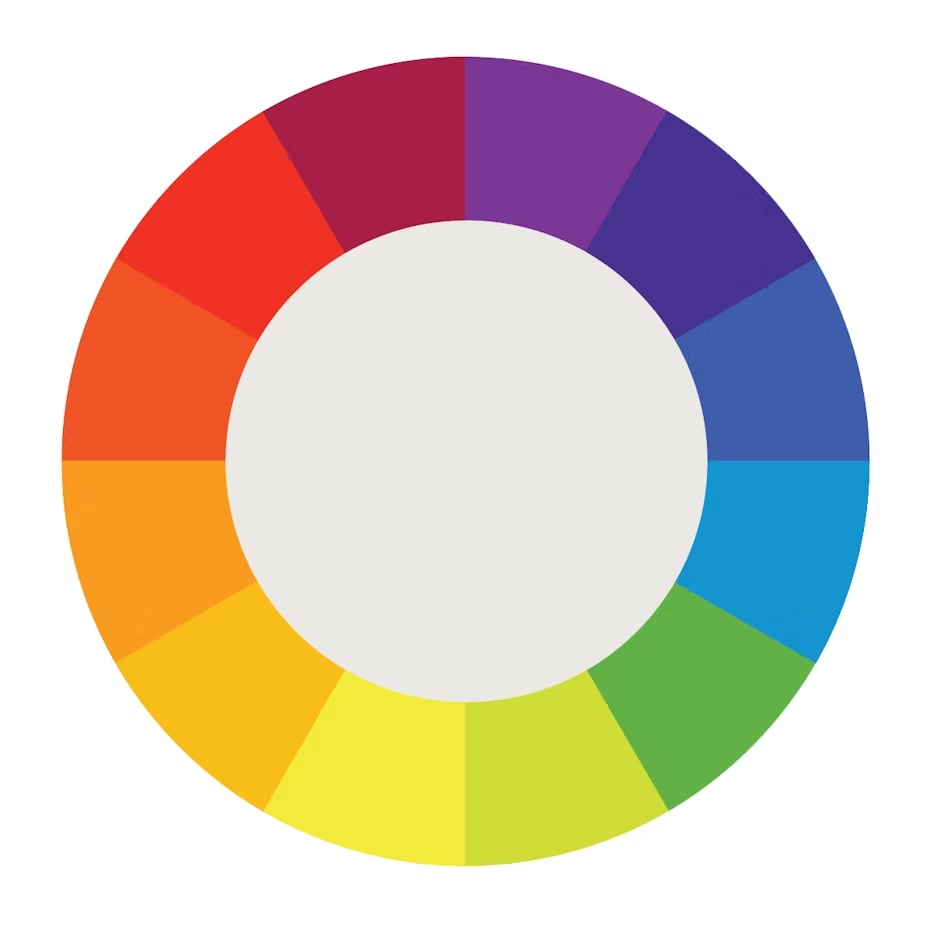
The colors perceived as warm form the left half of the color wheel, while those described as cold form the right half. The "temperature" perception is also reflected in the physical color temperature (K = Kelvin).
Shades add black to the color tone in varying intensity, while tints add white. One tone, on the other hand, complements black and white, i.e. gray.
Complementary colors are colors that lie opposite each other in the Fab circle.
Analogous colors lie next to each other in the color wheel (red, orange, yellow). One color takes over the dominance (leadership), another supports it and the third sets accents.
Color associations
- Blue
- Positive: consistency, competence, strength, quality, productivity, calmness, security, trust, wisdom, reliability
- Negative: curbs appetite (not suitable for food) - Brown
- Positive: masculinity, naturalness, resilience, reliability
- Negative: not suitable for calls to action - Yellow
- Positive: joy, friendliness, happiness, youth, competence
- Negative: Fraud, cowardice, poor quality - Gray
- Positive: strength of character, formality, practicality, professionalism, timelessness
- Negative: Distance, cold, boredom - Green
- Positive: refreshment, recovery, health, hope, nature, growth, prosperity
- Negative: Envy - Orange
- Positive: energy, happiness, optimism
- Negative: urges caution - Pink
- Positive: kindness, gentleness, femininity
- Negative: - - Red
- Positive: passion, love, strength
- Negative: fire, danger, violence, war, anger - Black -
- Positive: authority, evil, elegance, extravagance, power
- Negative: Threat, mystery, rebellion, death, grief - Violet -
- Positive: authority, power, creativity, sophistication, respect, spirituality, wisdom, prosperity
- Negative: sadness, aloofness (dark tones) - White -
- Positive: peace, purity, innocence
- Negative:
The color design can now begin accordingly. If text is to be used on a colored background, the contrast between the background and text must be sufficient to ensure smooth, effortless reading.
A bad choice is black text on a dark blue background, or yellow text on an orange background.
For texts that are placed over photos, you may have to place white text on the dark, black text over the lighter part of the image.
Typography
Just when you think you've reached the goal of a successful design, you stumble over the next hurdle. hat is typography?
Typography affects everything, from the selection to the layout of the font. Type not only serves to convey the core message, but also your self-image and purpose. For this to succeed, it is important to understand typography in order to be able to use it correctly.
Just as vocabulary is of fundamental importance when learning a foreign language, typography also needs vocabulary:
- Font family
A font family contains related fonts of different widths, weights and weights with common form characteristics. - font
A font is a set of glyphs (letters, numbers, punctuation marks and symbols) that are designed in a way that is typical for the respective font, e.g. Helvetica, Times New Roman.
In the digital world, a font is referred to as Font designated. - Font weight
The font weight describes the thickness of the strokes that make up the characters and is expressed as light, normal, bold or extra fat designated. - Font size
The size of the font is Point (Pt.corresponding to 1/72 inch; a font size of 6 pt is 2.1 mm high, the typical "small print"). - Font style
Font styles provide information about the appearance, such as Sans Serif (e.g. Helvetica), Serif (Times New Roman) or script (e.g. Lucida Handwriting), or decorative fonts (e.g. Amsterdam).
Due to the variety of "beautiful" fonts, you will quickly be tempted to include them in your design, but - stop!
Viewers also have preferences for fonts. Some are unpopular or overused, others are illegible. The choice of font should be made carefully. One for the headline, another for the body of the text. At most a third in the group, perhaps as a subtitle - no more!
A clear hierarchy guides the reader along the desired reading path and will convey all the intended information, easily, memorably.
If space is limited, you simply choose a smaller font, right down to the "small print", to accommodate the entire content. Wrong! At least if the reader is to fully perceive and understand the content. Nobody is going to use a magnifying glass to get to grips with the text.
This means shortening the text, limiting it to the essentials and, if necessary, changing the font in order to get the message across in full on the one hand and to maintain the pleasure of reading on the other.
Text alignment
There are four ways to arrange text bodies: Centered, flush left or flush right in justification or justified.
These texts here are written in flush left justified type.
Justification is the forced alignment of the words of each line to the left and right. This can generate unnatural word spacing, which makes reading more difficult. The eye is used to expecting regular word spacing and feels irritated if this is not as expected.
Faux pas - Whores and cobblers
What is that again? No, these are just typographical expressions that denote typesetting errors.
A cobbler's boy is a single line of a paragraph at the end of the page, a whore's child is the equally separate continuation of the sentence of a paragraph at the following top of the page.
Such constellations are considered disruptive to the flow of reading, unaesthetic and should therefore be avoided.
Background design
The background carries all elements of the design, images, headline, text content. It should therefore be kept discreet so as not to make texts difficult to read or to push itself into the foreground.
With an appropriate arrangement, e.g. recurring, albeit different headings, the background can also take on organizational tasks.
Let's assume that the same products are described on each page, but marked in different colors. The respective product color can serve as a background for the headline. This means that the reference to the described product is already given by the color alone.
The background is therefore not something that is misused to suppress the white void, but an element that can provide hierarchy, order and information.